These were taken at both of my grandparents homes because they have all these ornaments that they have collected over the years and what I find interesting is that they just sit there and gather dust, not being used in a sense or mostly just being for display.
Monday, 28 January 2013
Test Shots for Waste
These are some of the Test Shots for my " Forgotten" idea:
These were taken at both of my grandparents homes because they have all these ornaments that they have collected over the years and what I find interesting is that they just sit there and gather dust, not being used in a sense or mostly just being for display.
These were taken at both of my grandparents homes because they have all these ornaments that they have collected over the years and what I find interesting is that they just sit there and gather dust, not being used in a sense or mostly just being for display.
Friday, 25 January 2013
Concept for Fashion
For our concept we have decided to base it on gender identity and the refusal to conform to a standard. The evolving trend androgyny in the fashion industry and how the masculine-feminine boundaries have blurred. We want to focus on Portraiture rather than Fashion photography to focus on the model and the defining features and own identity. This is a rough mind map that we created:
Tuesday, 22 January 2013
Sunday, 20 January 2013
Initial Ideas for Waste
My Initial Idea for Waste is about Abandonment, which covers litter on the street, items being forgotten in everyday life such leaving things on public transport, things stored at home and things being given away to places such as charity shops. I am interested in how after we a use a product, some people carelessly discard it on the street which is litter, how things are forgotten about and how objects are given away to Charity Shops to find a new home and how when people move home, they leave behind furniture and other objects.
Jessica Backhaus


(from the series "What Still Remains")
Backhaus takes photographs of left-behind objects and rooms devoid of people, lending significance to things usually cleared away or overlooked. Her images ask the viewer to imagine where, why, and who — writing a story that illustrates the transience of time. When looking at this series I find the shots to have this sense of emptiness and isolation. I enjoy the obsure angles of some of the images in the series which gives this personal feeling to it.
Richard Wentworth


(from the series "Making Do and Getting By")
Oyvind Hjelman


(from the series "House that was Home")
The quiet photographs made by Oyvind Hjelmen are intimate philosophical explorations of time, memory, history, loss, (photography itself), and more.In this series, he documents the last bits of once-prized possessions in an old house, as the house is gradually emptied after the person who lived there has died. Again I find this series to have this sense of emptyness and loneliness, which is empasized with the use of Black & White Photography. In some of the images have the overexpose of natural light which starts to bleach parts of the image which in a way is a symbolism of the memories in that room being erased.
Jessica Backhaus


(from the series "What Still Remains")
Backhaus takes photographs of left-behind objects and rooms devoid of people, lending significance to things usually cleared away or overlooked. Her images ask the viewer to imagine where, why, and who — writing a story that illustrates the transience of time. When looking at this series I find the shots to have this sense of emptiness and isolation. I enjoy the obsure angles of some of the images in the series which gives this personal feeling to it.
Richard Wentworth


(from the series "Making Do and Getting By")
Oyvind Hjelman


(from the series "House that was Home")
The quiet photographs made by Oyvind Hjelmen are intimate philosophical explorations of time, memory, history, loss, (photography itself), and more.In this series, he documents the last bits of once-prized possessions in an old house, as the house is gradually emptied after the person who lived there has died. Again I find this series to have this sense of emptyness and loneliness, which is empasized with the use of Black & White Photography. In some of the images have the overexpose of natural light which starts to bleach parts of the image which in a way is a symbolism of the memories in that room being erased.
2nd Year Exhibition Task
NyctophobiaThe exhibition space itself was a small square shaped room which I thought was a little too small. I thought that the spacing of different pieces belonging to different individuals seemed to overlap and I thought was a little distracting because of the issue of the exhibition space. I thought that the choice of wall colour was good because it was some kind of panelling which gave the wall texture and the colour was a beige, cream colour which was not as distracting if the wall colour was white. The work was hung on the wall using different materials such as aluminium backing, wood backing and the use of frames. I thought that is exhibition had a unique element which was the use of piece of a fake fur coat. I thought this brought something different to a photography exhibition with having 3D to look at. In terms of the lighting I thought it was lit satisfactory but I thought that it was a little too bright.

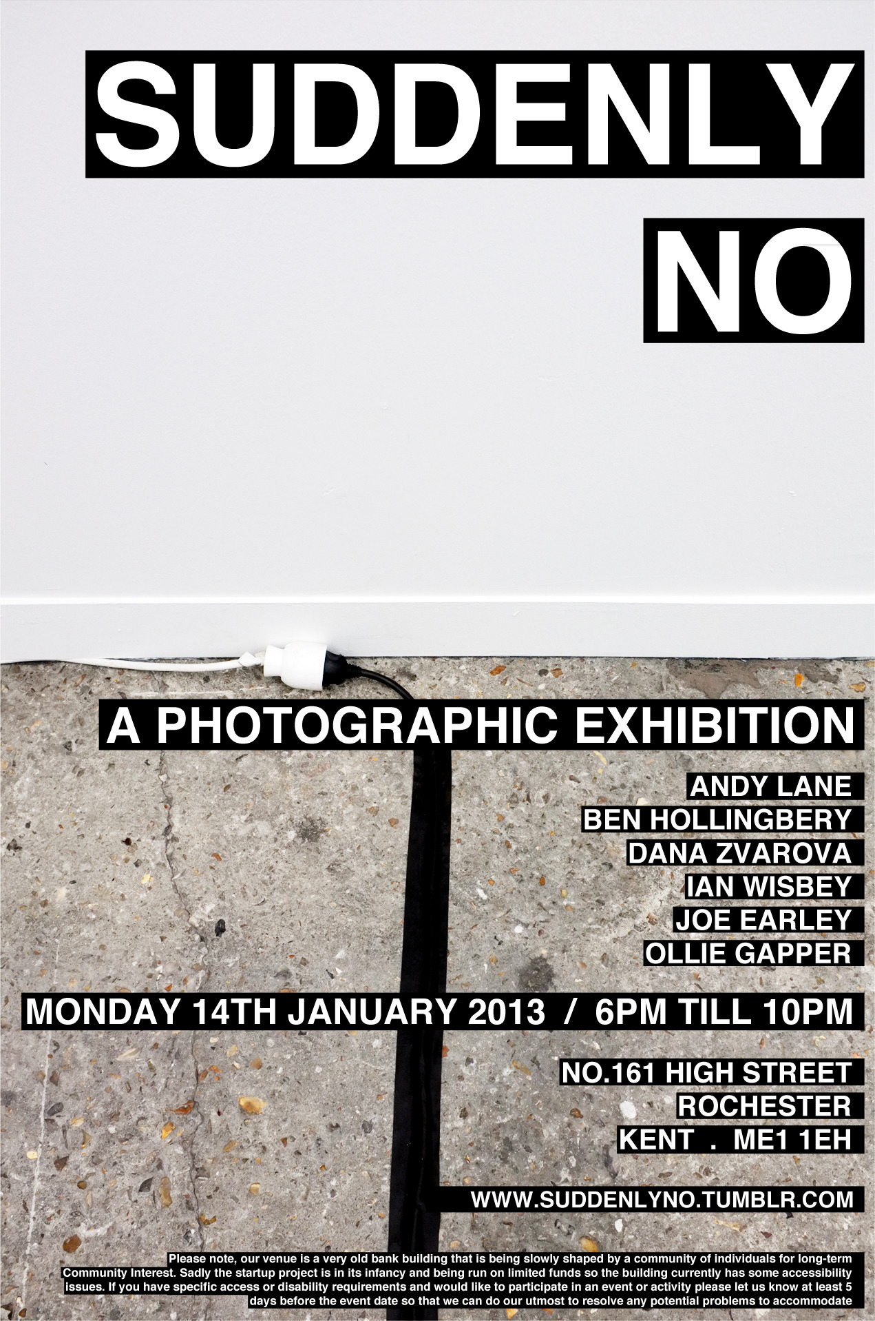
This exhibition was split into two parts one exhibition space upstairs and one exhibition space downstairs which I thought to be unique because you could compare two exhibition spaces within one exhibition. I found the downstairs space to be very intimate because of the extremely small space which in some respects could be considered claustrophobic to some. I enjoyed the choice of the wall because of the brick shapes that could be seen which gave the space a more aesthetic quality because of the texture. The upstairs exhibition was very similar to the “Nyctophobia” exhibition in terms of the exhibition space. I found this space to be more relaxed and less busy because of the student’s work being divided between the two exhibition spaces and the spacing was much better so that the viewer. In terms of the lighting I thought it was lit well but I thought that it was a little too bright and was a little distracting.

Friday, 11 January 2013
London Exhibition Task
Jonas Mekas: The Serpentine Gallery
This exhibition utilizes different sources of media to engage with the viewer with different senses such as film, film still images and an audio interview with Jonas Mekas about the exhibition playing when you enter. The Film stills are arranged in blocks and grouped together which makes the work seem as a whole, but also makes you look individually at the different film still images. In terms of lighting the exhibition is quite bright this is because the lighting is spread out on some pieces and combined with natural daylight. However, a few pieces have solely spot lighting to highlight the piece. In a display case there are film cameras that were used by Mekas to make his films; I think this gives the viewer a connection to the artist through the use of the equipment he used. Also what I found Interesting was how multiple televisions had been put together in a block showing multiple films at once because as the viewer you are trying to find something that interests you but you have the distraction of the other films being played. I thought that the exhibition flowed really well because different types of media were used in the same room which I think works better than having different media in separate rooms. However, I disliked the colour of the walls because I thought it was just too plain and playing it too safe for me.
Seduced by Art: Photography Past & Present: The National Gallery
This exhibition showcases how contemporary photography has been influenced by fine art practices. I found this exhibition to be quite interesting because of how photography is heavily influenced by fine art principles. The exhibition is dark with only spotlights illuminating the work which I liked because it emphasizes this idea of being drawn or seduced by the work. The pieces varied in size from quite small pieces to pieces that took up a whole wall section. There was use of a partitioned wall that isolated pieces so that it would attract the attention of the viewer. The Exhibition was divided into sections according on the theme used, e.g. Portrait, Landscape and Still Life. Because of that I thought the exhibition lacked a sense of flow. The walls were black which I liked because it worked well with the dark room to again highlight the pieces of work.
When comparing both exhibitions, they are both of similar size in terms of the exhibition space. When contrasting both exhibitions, Jonas Mekas only showed film and film stills while Seduced by art, showed both Painting and Photography. Moreover, Jonas Mekas had a very aesthetic quality to please more than one sense to it and Seduced by Art only was visual.
Tuesday, 8 January 2013
Fashion Tasks 1,2, and 3
Task 1
For our first Task, we were asked to find a fashion image that we thought was an "iconic" fashion image. I chose this image for GQ Magazine photographed by Mariano Vivanco which featured singer Lana Del Rey.
I chose this image because I think that Lana Del Rey envokes the glamour and sophistication of the 1960s and models like Twiggy. I think that all the elements work well together to create this aura of Sex and Seduction because of the Storytelling element of the background, the use of the prop e..g the rose, the bustier and the gaze of the model which is looking straight at the Camera.
Task 2
For our second Task, we were asked to take a Street Cast of a person. I chose to photograph this woman in Trafalgar Square.
For our first Task, we were asked to find a fashion image that we thought was an "iconic" fashion image. I chose this image for GQ Magazine photographed by Mariano Vivanco which featured singer Lana Del Rey.
Task 2
For our second Task, we were asked to take a Street Cast of a person. I chose to photograph this woman in Trafalgar Square.
Subscribe to:
Posts (Atom)


