NyctophobiaThe exhibition space itself was a small square shaped room which I thought was a little too small. I thought that the spacing of different pieces belonging to different individuals seemed to overlap and I thought was a little distracting because of the issue of the exhibition space. I thought that the choice of wall colour was good because it was some kind of panelling which gave the wall texture and the colour was a beige, cream colour which was not as distracting if the wall colour was white. The work was hung on the wall using different materials such as aluminium backing, wood backing and the use of frames. I thought that is exhibition had a unique element which was the use of piece of a fake fur coat. I thought this brought something different to a photography exhibition with having 3D to look at. In terms of the lighting I thought it was lit satisfactory but I thought that it was a little too bright.

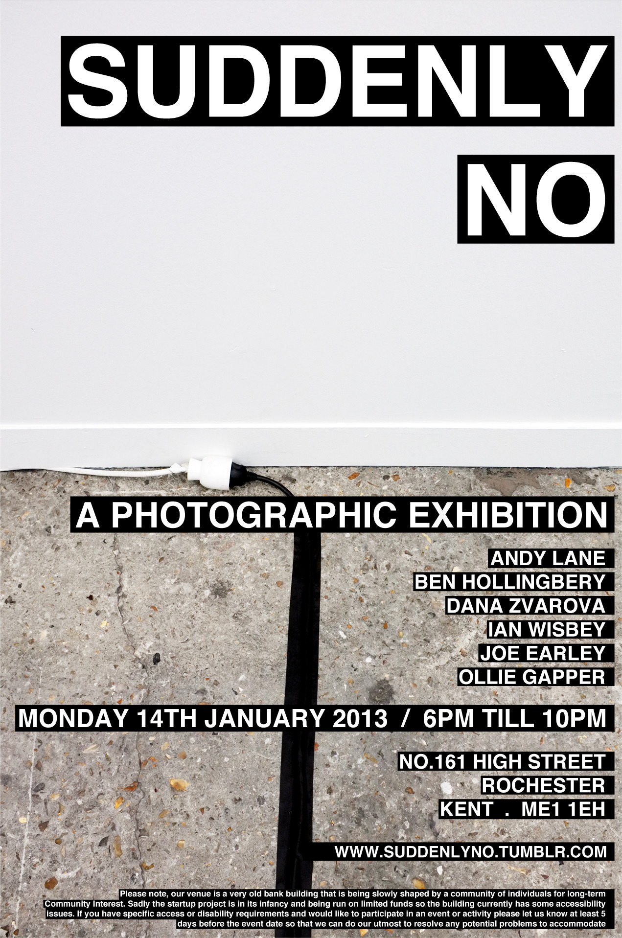
This exhibition was split into two parts one exhibition space upstairs and one exhibition space downstairs which I thought to be unique because you could compare two exhibition spaces within one exhibition. I found the downstairs space to be very intimate because of the extremely small space which in some respects could be considered claustrophobic to some. I enjoyed the choice of the wall because of the brick shapes that could be seen which gave the space a more aesthetic quality because of the texture. The upstairs exhibition was very similar to the “Nyctophobia” exhibition in terms of the exhibition space. I found this space to be more relaxed and less busy because of the student’s work being divided between the two exhibition spaces and the spacing was much better so that the viewer. In terms of the lighting I thought it was lit well but I thought that it was a little too bright and was a little distracting.

No comments:
Post a Comment