Monday 22 October 2012

Deconstructing Composition Task


In this Series called The Ridley Road Portrait Project by Kate Peters. She Photographs Tradespeople in Ridley Road Market, Hackney. Peters  celebrates the diversity and Multiculturalism in 21st century London. With her photographs she tries to create a lasting documentation of the Market through her Portraiture in wake of the dying high-street  small traders and traditional markets disappearing  in favour of chained stores and Supermarkets.

 In terms of Composition the work is very central in all of the pieces in this series. The viewer's eye is immediately drawn to choice of using props because the colours of the props stands out from the neutral backdrop and the clothing worn by the subjects. I think the use of props adds a deceiving  element to the photographs because without reading the story that is provided below the image a stereotypical assumption is made without looking into the context behind the images. The gaze of the subjects in the majority of this series is off camera an interesting choice made by Peters because this could be a metaphor for the loss of small independent shops in Ridley Road Market. The lighting is quite harsh in this series which I am not too keen on because it makes the photographs look like cut outs. 

Sunday 21 October 2012

Colour Printing Workshop

This is result of the Colour Printing Workshop that I had done on Friday 12th October :


Overall, I happy with the print because the colours of the print look right, the negative is a little underexposed. However, I still need to get the borders straight on the easel which is proving to be difficult. Also I need to improve on focusing on the eyes on my subject. I think this is due to the aperture that I choose.

Wednesday 17 October 2012

Idea for Commission Project Part 1: The Environment

My Idea for Landscape is going to be about how humans consume food, the demand for it and how producers keep up with demand by growing and producing food artificially in greenhouses rather than using traditional methods such as using the earth to produce food. I aim to show this idea visually by photographing plastic play food to emphasize this notion of artificialness.  


Peter Henry Emerson


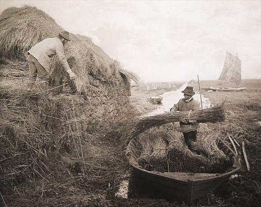
The reason why I wanted to look at Emerson because his work is the anti-picturesque, like it is not about how lovely and beautiful the agricultural landscape was but it was about the hard day to day lives of farmers during that time. 
Albert-Renger Patzsch


I wanted to look at Renger Patzsch because I admire the Uniformity element in some of his photographs because of the hard lines and shapes. This is a just a visual reference of what I want my photographs to look like in terms of my idea. 


Simone Nieweg

The Lighting in this image doesn't work well with the landscape because the colours  are brown and the overcast lighting makes everything look monochrome 

I think the lighting works better with the landscape because it has more even  lighting  working with the greens. 

With the camera position  I like how she has looked down onto the landscape which shows the detail of the plants. 

In this Series "Nature-Man Made" Nieweg is interested in the small scale working on the land and the interaction between man and the land rather than industrial farming. The series has a sense of tranquillity to it because of the soft lighting used where there is no shadows or bright light. There is also a presence of man in the photographs even though there are no people in the photographs. Also I find the series quite intimate because of the choice of camera height and distance. 


I am looking at Articles about the current Food Price Crisis that is happening due to bad weather conditions this summer, how this effects farmers and more importantly how it effects us as consumers :


So far I have negotiated access to land in Broad Oak, Canterbury and a allotment near where I live which I will be test-shooting this weekend.  


I have also been inspired by the Biblical Story of Adam and Eve and researched a painter called Lucas Cranach who was a German Renaissance painter and  painted a series on Adam and Eve and The Garden of Eden:


In the series Cranach makes many visual references to himself like his monogram inscribed on the tree of knowledge combined with the lion's outwards gaze. The Animals in the painting also make a reference to Christ like how the deer and the lion living together amicably in paradise. 

Frans Snyders 


Another Painter I wanted to Research was Flemish Painter Frans Snyders who painted Still life of Animals, Fruits and Vegetables. This series of images represents the abundance and fertility of the land, the celebration of fairly modern agricultural methods but also shows the toil and hard work required to make the bountiful harvest in the top left and right hand corners. 


Monday 15 October 2012

Deconstructing Andre Kertesz

Andre  Kertesz, Chez Mondrian, 1926
Piet Mondrian, Composition with Red, Yellow and Blue, 1930


Our initial thoughts when we first studied the photograph were loneliness this is because there is a mass emptiness within the image. This feeling is re enforced by the first part of research we did. Kertesz moved to Paris in 1925, a year before the photograph was taken. We feel the photograph reflects his loneliness because he left behind his various family members including his ‘unofficial’ fiancĂ©e, two brothers, and an uncle.

Kertesz’s photograph was influenced by Piet Mondrian, a  Dutch painter who discovered Cubism. The photograph was actually taken in Mondrian’s artist studio which features an artificial flower. Mondrian wanted to express the impression of pure reality. The artificial flower which is at the edge of the table suggests that it was moved to be in the frame of the image. We know that Mondrian would always have an artificial flower in his studio as an expression of nature, so adding the flower to Kertesz’s image is almost a nod to the original studio.

The composition of the image is divided in half, the left being the foreground and the right the background.
The left side reflects cubism, the influential movement that started in that very studio by the straight lines in the furniture and doorway. However the curves of the staircase in the background soften the profusion of right angles and straight lines, representing breaking away from a particular era which was the artistic movement in the 1920’s and keeping individuality.
The image in itself is very contrast with very subtle midtones. The only section that we notice to have any greyscale to it is the flower. The greyscale in this gives the flower more detail and more depth, purposely done along with the lighting of it to draw the eye of the viewer.

At the time the image was made Paris was being taken over by the art deco movement all very grand and a lot of decoration which is the complete opposite to what is shown of the studio, being very plain and simple. Also in Paris at this time was the demand for personal freedom, again mirroring the photographer’s decision to move to Paris on his own. 


Sunday 14 October 2012

Seminar 3: Research Task


I am going to be comparing photographers Timothy O’ Sullivan and Edward Burtynsky for this research task. Timothy O’ Sullivan was commissioned by the US federal government to document the exploration of the American West for its untapped natural resources. In context the American-Mexican War was roughly 30 years prior to O’Sullivan’s series of the American West. His photographs portrayed somewhat the American West as picturesque because of the unspoiled landscapes. Also it is described as sublime because of the untamed, dangerous and unknown formations of the landscape. Additionally prior to the series there had been a mass migration of Americans due to “Manifest Destiny” and of European Immigrants because of the will to shake off the oppressive nature of 19th century Europe and also due to the Gold Rush in Western states like California. Scales plays an important role in his photographs because it shows the vast nature of the American West not seen before. In terms of composition the majority of O’Sullivan’s work can vary from central to spread across the frame.

Edward Burtynsky main theme for his work is how nature has been transformed through the presence of man and industrialisation in the modern wold. When I view Burtynsky’s work it provokes anger within me because it shows how man has abused the planet through pure selfish desires and deep seated greed. However, I like the uniformity element in some of his work because I perceive it as a metaphor that we are all alike in our desire to gain wealth and power. Also I think that his work is a symbol for the death of the American Dream set out in the United States roughly 60-70 years ago by the lower and middleclass because we are now running low on fossil fuels. In context his work can be referencing the power struggles between nations of the world for control of natural resources. Also his work is connected to environmental disaster stories such as the 2010 BP oil spill in the Gulf of Mexico.

The Similarity between O’Sullivan and Burtynsky are that both document the presence of Man on the Land in the American West. The differences between these photographers are that O’Sullivan’s work documents the beginnings of the Industrial revolution whereas Burtynsky’s work documents the death of Industrialisation due to economic difficulties. I believe that there is a connection between the two photographers work because Burtynsky is documenting the direct result of O’Sullivan’s documentation of the presence of man in unspoiled landscapes in extracting the natural resources. 

Tuesday 9 October 2012

120 Medium Format Colour Portrait & Environment Shoot

Today we went out into Rochester High Street for the second time but this time we were asked to photograph a person in Rochester High Street in the context of their environment using colour film. I thought that this task went very well and the negatives came out exposed really well so I am really happy. Environment Shoot

Monday 8 October 2012

My Idea for Body

My idea for Body is going to be about How the High-Street has been affected by the recent Economic Climate like the Initial Economic Downturn in 2008 and more recently the double dip recession of 2011/12. I want to focus on the small independent Shops as opposed to Big Chained Shops because I am interested how the current economic climate has effected the individual rather than the many which gives the issue a more personal insight. I am going to be asking questions to the owners of three independent shops in Rochester High-street to gain some knowledge of the economics of the local area.


Kate Peters


In this Series called The Ridley Road Portrait Project by Kate Peters. She Photographs Tradespeople in Ridley Road Market, Hackney. Peters  celebrates the diversity and Multiculturalism in 21st century London. With her photographs she tries to create a lasting documentation of the Market through her Portraiture in wake of the dying high-street  small traders and traditional markets disappearing  in favour of chained stores and Supermarkets.

 The viewer's eye is immediately drawn to choice of using props because the colours of the props stands out from the neutral backdrop and the clothing worn by the subjects. I think the use of props adds a deceiving  element to the photographs because without reading the story that is provided below the image a stereotypical assumption is made without looking into the context behind the images. The gaze of the subjects in the majority of this series is off camera an interesting choice made by Peters because this could be a metaphor for the loss of small independent shops in Ridley Road Market. The lighting is quite harsh in this series which I am not too keen on because it makes the photographs look like cut outs. Peters is relevant to my project because she is influential to my Studio Portrait task because of the context behind her work. The important element I have learnt from her work is the use of props. 


John Delaney 


In this series "Hoboken Passing" explores the survivors of a neighbourhood in transition. Delaney documents owners and workers of traditional family owned "Ma and Pa" shops. This traditional way of life and trade in recent years has been sadly disappearing from the streets of, New Jersey due to the changing economy and being replaced by national chained stores. From this series I get a rich sense of history and culture because of the rich textures and colours used. Also I really like the use of studio lighting in the series because I feel it highlights the urgency of this dying way of life and trade. Delaney is relevant to my project because of the context behind this series. The important element I have learnt from this series is the use of the environment with the subject. 
Dave Alexander


Lee Jeffries 


In this series called "Homeless" Jeffries documents the problem of Homeless People on the Streets of Europe and the US. I find these portraits quite haunting because of the detail captured in the subjects face. Also the portraits are filed with emotion because of the dark tones captured. However, I find the portraits to be quite beautiful because of the lighting used. 
Laura Stevens


In this series "Us Alone" Stevens photographs the struggles of coulpes who fight for their personal freedoms. This series breaks the reality of the "Happy Couple" and documents the struggle of coexistence between Men and Women. Even though I can't see it on the subjects faces there is this huge tense atmosphere in the photographs, I think this is due to the lighting used which is a kind of "Spotlight" lighting.  
Richard Renaldi


In this series "Figure and Ground" Renaldi uses street photography to document the changing American Social Landscape. I really admire the use of a shallow depth of field in this work because it makes the viewer be drawn into the photograph and focus on the subject. I like the use of mixed lighting in this series using Natural and Indoor Lighting which gives an evenness to the work. 
Jeff Cowen 


John Thomson


This series by Thomson was to document the different Races of Humans in places that had never been seen before these photographs were taken. I like the simplicity of the photographs because of the neutral white background used. I admire the neutral expressions on the subjects faces because it makes the documentation seem more truthful and accurate. Thomson is relevant to my project because of the use of the gaze and facial gestures used by the subject.  


Articles 


Sunday 7 October 2012

Black and White Printing Workshop

We had a workshop in Black and White Printing last week. I found it useful because it was a refresher from Foundation because I haven't been in or used a Darkroom in over 5 months. The Aim of the workshop was for us to produce two prints that we were happy with. I am happy with the prints but to Improve the prints I need to make sure I get a better exposure on the film and be more careful with the straightness of my prints e.g. the easel.


Like for example the print at the top has quite a lot of grey tones rather than black and white which is disappointing  and the print at the bottom has to be straighter. I think I might need to practise my Printing techniques to get better results in the future.


Thursday 4 October 2012

120 Format/ Rochester High Street Shoot

The Result of my first attempt of the Location Shoot in Rochester High Street was that I had thin negatives which meant that they were underexposed. This was because of improper use of the Light meter and using 1/125 Shutter Speed and an Aperture of F.4. I decided that I needed to re-shoot to improve the exposure of my Negatives which would be achieved by using a larger aperture and a slower shutter speed. The Result of the re-shoot were better but still the negatives were underexposed using a Shutter Speed of 1/60 and a aperture of F 8.0 so that the back and foreground would both be sharp. The Lesson I have learnt from this shoot was you should always set the camera by what the Light meter reading tells you.

(N.B These Photographs are scanned in from the Negatives as the Print Machine is Broken)
Neutral Shoot 1 Neutral Shoot 2

Initial research for The Environment


Caspar David Friedrich 


Fay Goodwin 


Albert Renger-Patzsch